


Since the day it opened, White Moon has brought a level of quality to the coffee and food scene in Sylva, NC that it never had before. The original owners, Don and Cecilia were super talented people, both artistically and culinarily, that moved to Sylva from New York(I believe). They opened a coffee shop that had the perfect minimalist aesthetic that served only the finest coffee, and food with only the finest ingredients. You’re gonna pay a little more here but you’re paying for quality that you won’t get anywhere else, and when you bite into a Pauli G - their $13 sub sandwich - you immediately understand.
The original logo paired with White Moon’s identity perfectly. It was minimal, hand drawn, and simple. White Moon’s interior was exactly what you’d expect, with white walls, wood and black metal accents, and a menu board with wooden rows of moveable letters to spell out each menu item. Later they would open Dark Moon, a cocktail bar in the back of the coffee shop with a super dark and cozy feel that’s perfect for ending the night with a cocktail while you have a nice quiet hang with some friends.
When Don and Cecilia sold White Moon to Jonny and Jill in 2022, I had just ordered my usual - a Pauli G and a Modelo - when Jill ran up to me and said “Hey! would you want to redesign our logo!” I very excitedly accepted and got to work. The objective of the new logo was not a rebrand or redesign, but an evolution. They also wanted 3 different versions. One that had both the White Moon and Dark Moon logo together, and then they wanted it to have the ability to be split apart into two different logos. One for White Moon, and one for Dark Moon.
Under the previous owners, White Moon was a great place. You’ve probably even been to a coffee shop with similar vibes. But it was missing something, and during the discovery phase of their redesign we actually struggled to put our finger on exactly what that was. But no problem, we have a direction to go in and we’ll explore that.
The original idea behind the redesign was to abandon the hand drawn style logo and lean into a more clean and polished version of the logo. Looking back at those first two rounds of designs, I almost cringe. Not because the designs were bad, but because they didn’t represent the new White Moon at all. But back then, we didnt know that. All we knew is that it didnt feel right and we weren’t sure why.
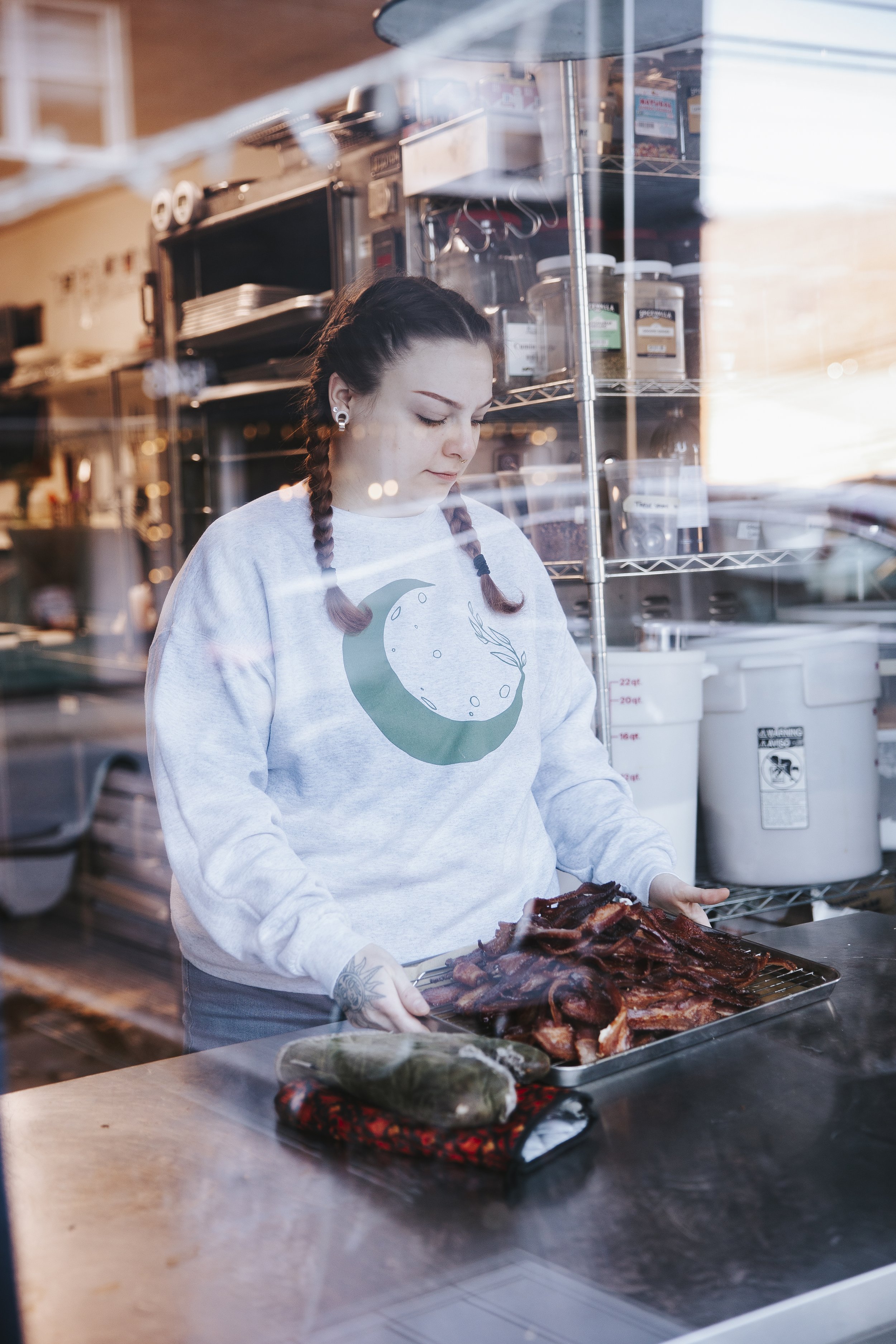
Slowly, Jill and Jonny started making changes inside of White Moon, the largest of which was a giant mural that covers the whole back portion of the cafe. It’s a spray painted, metallic blue, green, and yellow mural of a forest - a major departure from the minimal aesthetic. They also added bacon to the menu! This being a large departure from the delicious, somewhat health conscious, and at times uninteresting menu. White Moon’s baristas were always friendly. The kind of baristas you could ask “what’s a cortado” and they’d explain it to you instead of rolling their eyes at you. They hired more baristas who fit that description. They turned the music, laughter, and decor up a bit while turning down the quiet and reserved attitude that White Moon could have. Eventually you would walk in, and you weren’t walking into a quiet hipster paradise. You were walking into a loud, colorful, and wonderfully smelling coffeeshop with highlights of Bergen’s booming laughter, colorful art, and music that kinda made you want to dance.
The third iteration of the logo I presented to them was a clean version of the logos you see on this page. They really liked it. But then Jonny said “can we see it in a hand drawn version?” I was so surprised by this because this wasn’t at all what we discussed when we met to create the brief. But then it hit me. None of this stuff is what we discussed. Jill and Jonny were finding out what White Moon’s identity was in real time. They were essentially making White Moon an extension of themselves. I gave them the hand-drawn version of the logo and immediately we all felt that it worked.
I learned a really important lesson in the process of making this logo. Design brief meetings are important. But it’s more important to immerse yourself in your client’s business and learn as much about them as you can. Because if you dont, you might miss all of the little things that make them who they are. I’m so glad I didn’t miss this. This logo captures their identity and personality and it was an honor to do this for them. After all, this is my spot. This is the place I fell in love with and have been going to for food, coffee, and a great atmosphere to work in for years. When our son was born, we had friends bring us Pauli G sandwiches during the first few days because we couldn’t leave the house for long enough periods of time to get one ourselves. I have client meetings here. My family has Sunday morning breakfast before church here. This is my spot, my coffee shop, and I cannot understate how grateful I am that they asked me to design their new logo.
Today, White Moon is bursting at the seams. Saturdays and Sundays, the line is out the door. You walk in and you see a beautifully illustrated chalk board with their menu items right beside their wall of merch, coffee bags, and local crafts. The counter features their glass case of amazing pastries with home-made, small-batch scones, muffins, cookies, and treats. They keep a puzzle on the counter next to the pastry case, which is a genius way of engaging with their customers while the staff is running around fulfilling the thousand or so orders that they get every day. Then you’re greeted by the friendliest baristas in western North Carolina who take your order, give you a number, and then you find a seat and wait in anticipation as your breakfast or lunch is being crafted in the kitchen just behind you.
Jill and Jonny have poured their souls into White Moon and you can tell. It’s the friendliest, tastiest, most welcoming place in Sylva and the community knows it.

Old White Moon and Dark Moon Logos

Redesigned to incorporate both businesses in one logo mark

Full Logos

Icons


“We love Todd so much and we’re going to write a review for him to include in his portfolio. Coming soon!”
- Jill and Jonny Rutt, Owners


My photographer is Tia, owner of Jhawke Photography. You wont find a more talented, creative, and kind photographer anywhere. I was thrilled to have her do all the photography for White Moon’s rebrand and she killed it, like she always does!


